

Car rental upsell: your counter staff do it. Your website should too.
May 8, 2026AI traffic to travel is up 194%. Here’s what car rental operators need to know.
June 25, 2026The customer has just booked. They’re engaged, they’re slightly anxious about their trip, and they’re about to open your confirmation email. Most car rental operators send them a booking reference, a date, and a generic thank you. That’s a missed opportunity.
The confirmation email arrives at the moment of highest engagement in the entire customer journey. The booking is done, the credit card has been charged, and the renter is paying close attention to everything you send them. What you do with that moment shapes their experience before they’ve set foot near a car.
The questions every renter has when they hit send
When someone completes a car rental booking, they immediately want reassurance on a handful of things: did it actually go through, where exactly do I go, how do I get there, what do I need to bring, and what happens if something changes. Most confirmation emails answer the first question and ignore the rest.
Those unanswered questions become phone calls to your customer service team, messages to your support inbox, and in some cases, anxious renters arriving at the wrong place at the wrong time. A well-structured confirmation email resolves all of them upfront. It reduces inbound contacts before the rental and means renters arrive at pickup prepared and calm rather than confused and stressed.
Location information needs more than a map link
For off-airport operators, location information is the most important thing the confirmation email can contain, and a Google Maps pin is rarely enough. Renters arriving at an unfamiliar airport under travel stress need to know exactly where to go: which terminal exit to wait at for the shuttle, how to identify the bus, roughly how long the transfer takes, and what to do if they miss it.
Google Maps won’t show your shuttle stop, your specific signage, or the bay your bus departs from. For many operators, the right solution is a custom illustrated map: a clear, simple diagram showing the airport layout, the pickup point, and the route to your location. These aren’t complicated to produce, but they’re far more useful to a renter than a generic satellite image.
The same logic applies to off-airport city locations. Street-level directions, parking guidance, and local landmarks all reduce friction at the moment it matters most.
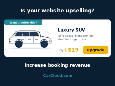
The confirmation email is the right time to upsell
A renter who has just completed a booking is in exactly the right mindset to consider add-ons. The decision to rent is done. They’re not being asked to commit to something new; they’re being given the chance to improve a trip they’ve already committed to.
The confirmation email is a natural place to surface the extras they didn’t add at checkout: child seats if the booking is family-sized, GPS for renters heading somewhere unfamiliar, a fuel plan for those who’d rather not think about it at return. A vehicle upgrade is also worth considering here, particularly for renters who booked quickly and might welcome a better car for a modest difference in price.
None of this needs to be pushy. A single well-placed section that says here’s what you can still add before pickup, with clear pricing, will convert a portion of renters who simply didn’t think to look at the time of booking.
It’s the first impression of your business, not just a receipt
For many renters, the booking website and the confirmation email are the only touchpoints with your business before they arrive in person. A plain-text confirmation or a broken HTML template tells them something about your company whether you intend it to or not.
A well-designed email tells them the booking is being handled professionally, that someone has thought about their experience, and that the company they’ve chosen is worth trusting. It’s also a chance to set expectations: what to bring to the counter, your opening hours, who to call if plans change. Getting those details in early removes a whole category of pre-rental friction.
A good confirmation email is closer to a web page than a text document
This is where many operators underestimate the work involved. Designing and building a confirmation email that actually looks right is not as simple as writing a nice message. It has to render correctly across every major email client including Gmail, Outlook, and Apple Mail, each of which handles HTML and CSS differently. It has to work on mobile screens, where the majority of email is now read, which means proper responsive layouts that adapt to smaller viewports rather than just shrinking everything down. It has to handle dark mode, which inverts colours in ways that can make text unreadable or images look broken.
Most operators also need more than one template. An airport pickup email should contain different location information to a city centre pickup. A long-term rental might warrant different messaging to a standard weekend hire. A booking with a specific vehicle class might include tailored content about that vehicle. Building those variants requires the same kind of structured, tested approach as building web pages.
Plain HTML copied into a template field will not produce a professional result. Getting this right takes design skill, development time, and testing across devices and clients.
Where to start
The most common place to start is the location section. If you’re an off-airport operator, a clear pickup guide and a custom map illustration will have the most immediate impact on renter experience and will reduce the most common pre-rental contacts.
From there, add a simple extras section pointing renters to the most commonly added items for their booking type. Then look at the design itself: if your current confirmation email breaks on a phone or looks like it was built in 2009, that’s worth fixing before anything else.
If you’re a Carcloud.com customer and want to review or improve your confirmation email setup, talk to your account manager about what options are available on your platform.

